 Tailwind CSS
  Tailwind CSS
 What is Tailwind CSS?
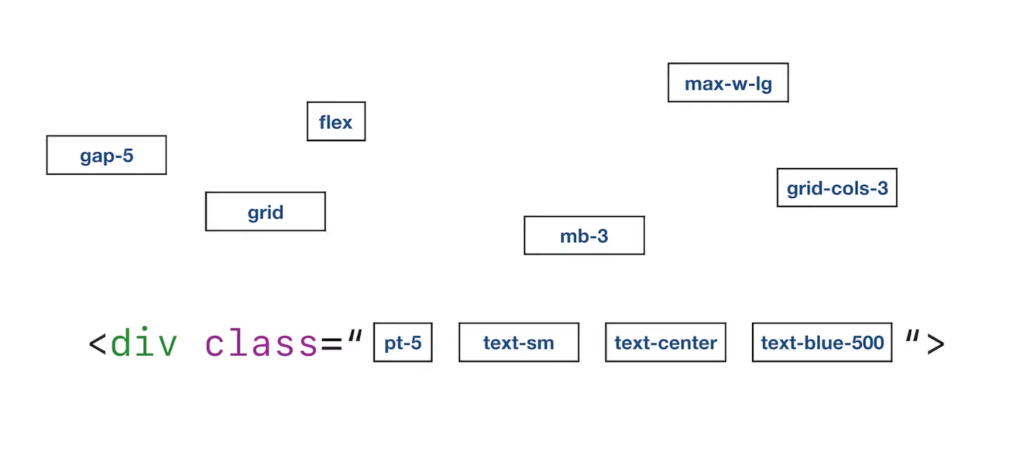
Tailwind CSS is a CSS framework to add styles to a web page without leaving the HTML. In the same document where you mock up the page, you apply the classes you need.

These classes provided by the framework are utility classes. Each one has a specific function. They are like Lego pieces where you use the ones you need.
How does Tailwind CSS work?
Let’s see how to use Tailwind CSS with an example: Imagine you have an H1 header, and you want to apply 3 properties: a size of 48px, bold, and centered.
With standard CSS, you would write a class similar to this:
.title { font-size: 48px; line-height: 1; font-weight: 700; text-align: center;}And you would apply it to your header like this:
<h1 class="title">This is my header</h1>However, with Tailwind CSS you don’t have that separation between HTML and CSS. You have at your disposal all the utility classes (as if they were pieces) for you to use directly in the HTML. So you would do it like this:
<h1 class="text-5xl font-fold text-center">This is my header</h1>- The
text-5xlclass defines a size of 48px - The
font-boldclass makes the text bold. - The
text-centerclass centers the text.
At first, it’s normal that this string of classes is a bit scary and gives a feeling of clutter.
The solution with standard CSS seems more organized, but when time goes by, after creating the page, if you have to go back and make any modifications, at a glance, you know what the classes do when you use Tailwind CSS. However, with standard CSS, you have to look up the definition of the title class.
No matter how much you read, your mind won’t make that click until you try it. When you’ve been building a page with Tailwind CSS for a while and experience it, you’ll realize its advantages.
What are the advantages over using standard CSS?
- You don’t waste energy thinking about class names. Besides, if you choose a bad name, you may need a pretty laborious refactoring later on.
- You don’t need CSS files because everything is worked into the HTML.
- If you make a change to one page, you won’t break the rest.
- There are predefined limits. Although you can set specific values, thanks to the Just-in-Time engine, the classes have predefined values. This makes for good visual harmony.
- You can define responsive styles without using media queries.
- You can set CSS states without the need to use pseudo-classes.
However, if you have components in your page that use precisely the same classes, you can create a CSS to avoid repeating code. The good thing is that even there, you use the Tailwind CSS classes.
For example, imagine that all the buttons of your page have the same styles, and you don’t like to repeat them. You can define a CSS like this:
.btn { @apply p-2 text-base font-semibold text-white bg-gray-600 rounded-sm;}Then you will only have to use the btn class in each button you have.
As you can see, at the beginning, I used @apply. This is a Tailwind CSS directive so that it knows that what follows are not standard CSS styles but Tailwind CSS utility classes:
p-2applies a padding of 8pxtext-baseapplies a font size of 16px and a line height of 24pxfont-semiboldapplies a font weight of 600text-whitesets the text in whitebg-gray-600sets the background torgb(75 85 99)rounded-smapplies a border radius of 4px
Who uses Tailwind CSS?
It is difficult to say which websites are using Tailwind CSS because it is growing steadily.
But there are top-rated websites already using utility-first frameworks, which is the same approach as Tailwind CSS, such as GitHub, Twitch, Kickstarter, Heroku, or Segment. GitHub, in fact, has its own utility-first framework called Primer.
Is Tailwind CSS worth it?
If you want to see a real example, it’s right in front of you. This website is designed with Tailwind CSS.